Claude Design’s two hierarchies: what you see versus what you get
In the past two weeks, a few people have asked me how I use Claude Design. I shared my workflow and while doing so I noticed that the Claude Design team is juggling two different naming systems in their Design Systems and Projects. They tried to marry design-concepts with code conventions.
- You design a form as a “Card” in the interface, and it becomes a “Component” or a “guideline” when you download it.
- You experiment with a new design and Claude Design generates an “Exploration” for you — which never takes a place among the Design System’s “Groups” and “Cards”, but can be recovered from the project files.
The naming conventions in the Claude Design project architecture differ from the interface copywriting. There’s a tiny ongoing semantic clash between Anthropic’s interface designers and their developers.
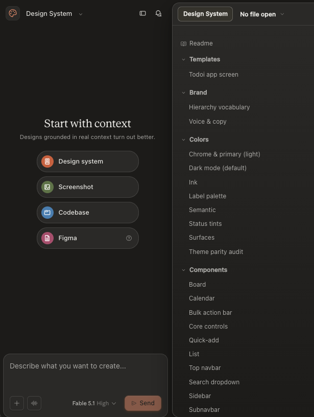
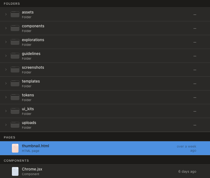
Claude Design hierarchy on disk VS what their GUI shows
Below is an example Design System structure. Select anything on either side to see what it connects to.
Nothing selected
Every line drawn between the panes exists only because a marker says so. Pick a folder to see where its pages surface, or a group to see what feeds it.
Links shown are the ones recorded in Claude_Design_info.md. Six groups have no folder recorded there; selecting one says so rather than guessing.
What the words mean
Three levels of containment, and three content types that sit beside the innermost one rather than inside it. Point the diagram at something real and the vocabulary resolves.
The whole thing. Its output is a compiled bundle plus a manifest that consuming projects bind to.
A named section in the sidebar. Groups come from the cards themselves: each card declares its group, so the sidebar is the set of group names in use.
One rendered specimen: a name, a one-line subtitle, and a live preview at a fixed viewport. Cards are standalone HTML pages, so what you see in the tab is the real thing running, not a screenshot.
Component shipped code
An exported UI component (Button, ItemCard, ListColumn) available to consuming projects as code. It lives in a folder alongside a hand-written .d.ts contract, and the card in that folder supplies its thumbnail.
Token a CSS variable
One named value: colour, type, spacing, radius, elevation, motion. 193 of them, defined in tokens/ and pulled in by styles.css.
Template a starting file
A copyable starting file for a whole artifact, shown to consumers in its own Templates group.
Read more research … 3 sections
Two levers, one of which does nothing
Move the file between folders, or edit the group named in its marker, and watch which of the two changes the sidebar.
Move the file
Edit the marker
Nothing moved yet. Try the blue lever first.
Nothing gets promoted
A card is not a draft of a component, and an exploration is not a draft of a card. The flow runs one way and ends in three possible places.
I'm about to make a Components card. What else do I make?
The component code and its hand-written .d.ts type declaration.
The card can't render without them.
And a guidelines card?
Nothing else. Documenting drag feedback correctly is the deliverable.
There is nothing behind it to build.
Big differences between Claude Design and ReactJS
Claude Design and React both hold a pile of files and build something else out of them, so the folder trees look interchangeable. They are not. The colours keep their meaning here: magenta is still “the declaration decides”, which is Claude Design, and blue is still “the path decides”, which is React.
Start where they agree
Five ideas both systems share. Open one to see the same idea in each dialect.
Pull the same two levers, watch them invert
These are the levers from the card lab above, aimed at both systems at once. One file, one folder move, one rename of the thing declared inside it.
Claude Designa specimen page
Reacta component module
Watch the rest of the differences
Six of them, about ten seconds each. Press play and let it run, or step through at your own pace; two of the panels want clicking.
Both rule sets run on the same folder at the same time in this repository: components/core/Button.jsx is bound to its importers by its path, while components/core/Button.card.html is bound to the Components group by its marker. Move that folder and exactly one of those two bindings breaks.